The AI was working. The product around it wasn’t. That’s what we fixed.
How a ground-up UX redesign transformed Ellipsis Health’s voice-based mental health platform from a confusing prototype into a product that impresses clinicians, converts investors, and guides patients with care.
CLIENT: Ellipsis Health
INDUSTRY: Digital Mental Health / AI Diagnostics
SERVICES: UX Redesign · Interaction Design · Prototyping · Usability Testing · Design Sprint
THE SITUATION
Ellipsis Health had built something genuinely novel: an AI solution which analyzed a short voice sample and produced an accurate clinical measurement of a patient’s depression and anxiety. The underlying technology was solid. The product wrapped around it was not — it was bare-bones, confusing to patients trying to use it, and difficult to demo convincingly to the health system clients and investors the company needed to grow.
We often see this pattern in early-stage digital health startups. The technical innovation gets extensive early attention — rightly so, in many cases, to drive further investment — while the product experience becomes something to sort out later. “Later” tends to arrive at an awkward moment, often right before an important sales cycle or funding round.
THE CHALLENGE
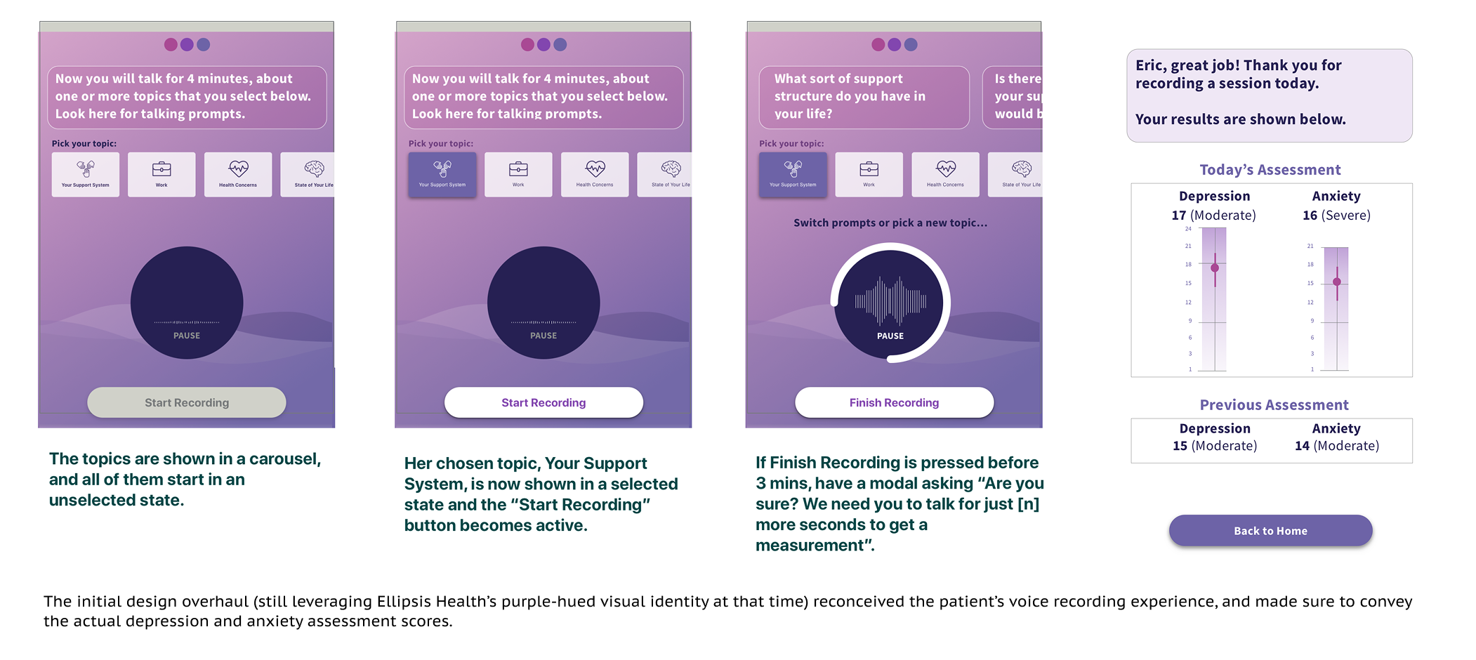
The core interaction at the heart of the Ellipsis app is deceptively delicate: ask a patient experiencing depression or anxiety to speak freely for three minutes on a series of topics, and make that feel comfortable, meaningful, and trustworthy rather than clinical and strange. The interface had to earn that trust quickly, guide without feeling mechanical, and produce an experience compelling enough that a patient would actually complete it — and come back.
At the start of the engagement, Ellipsis had just one product: the patient-facing native app, which needed a deep redesign on multiple levels — covering visual design, interaction design, and product definition.
Lizz realized: the interface had to earn patient trust quickly — and make speaking for three minutes feel meaningful rather than strange.
THE APPROACH
We begin with a redesign of the patient app, still using Ellipsis’ purple-hued visual identity. The work centered on creating a detailed, humane visual experience that guided users through the voice recording flow with clarity and warmth. Every screen had to reduce anxiety rather than add to it — a meaningful constraint when the users themselves are being assessed for anxiety.
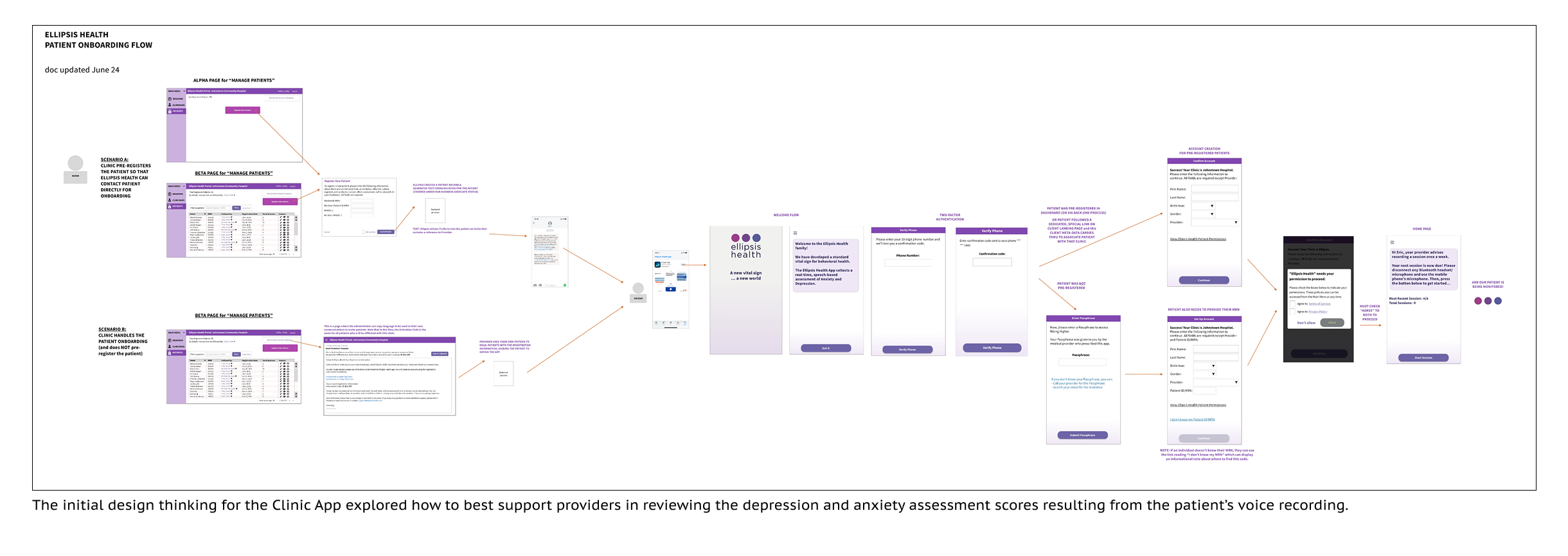
Ellipsis also recognized that they needed to develop a web-based Clinic App solution to support the behavioral health clinicians who work with these patients. Devise created a simple and usable framework for rapid development of the provider-facing solution.
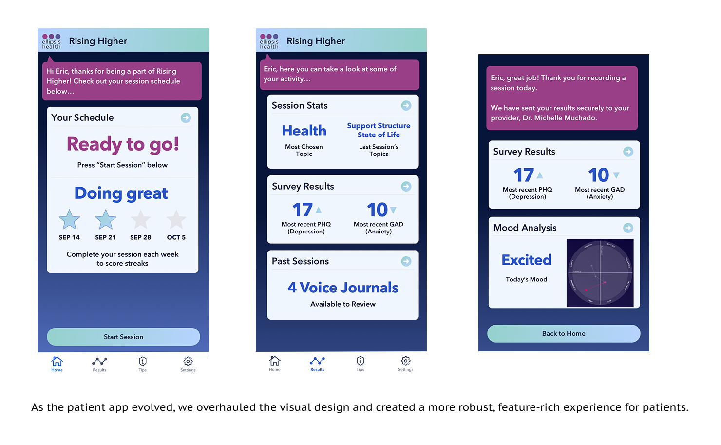
Using an interactive prototype, we ran usability tests of the patient app, and identified significant opportunities to drive increased engagement and retention. The app wasn’t offering enough of an overall experience framework to demonstrate its utility to patients. We added more framing elements and supporting insights to achieve continued user engagement.
THE OUTCOME
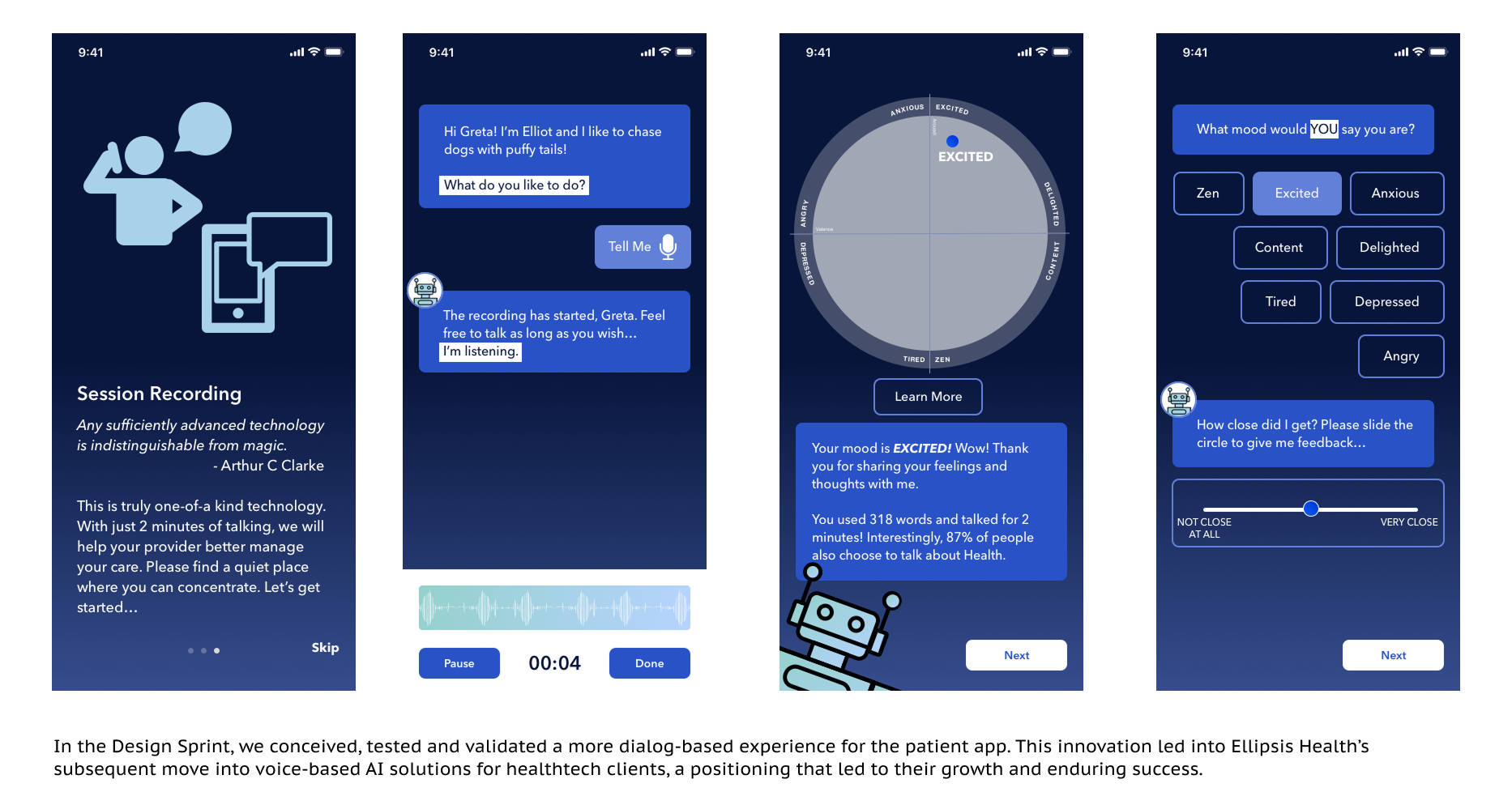
After months of core design and product definitional work, we needed to pursue some deeper conceptual innovations. To do so, ran a design sprint to tackle the next-generation app concept — compressing months of conceptual debate into a week of structured problem-solving. We prototyped the sprint output rapidly and put it in front of real users via unmoderated remote testing through UserTesting.com. The feedback was direct and positive: users loved it.
A product that sells
Post-redesign, the Ellipsis platform became a credible demo for clinical clients and investors — a direct commercial unlock that the previous interface had been blocking. In the years since this original engagement, Ellipsis has been recognized as a leading digital health company.
Two surfaces, one coherent experience
The patient app and Clinic Portal functioned as a unified product — different users, different needs, sharing a design language that communicates care and clinical rigor simultaneously.
A validated next-generation direction
The design sprint and rapid prototyping gave the team tested, user-validated signal on where to take the product next — without committing engineering resources before the concept was proven.
Mental health technology sits at a genuinely difficult intersection: the users are often vulnerable, the clinical stakes are real, and the product has to simultaneously serve patients, clinicians, and the institutional buyers who sit between them. Getting the UX right in this context isn’t polish — it’s how the technology actually reaches the people it was built to help.