Hospital revenue cycle software was a patchwork of disconnected tools. We designed the glue.
How field research across a complex, multi-role hospital workflow produced a unifying design insight — and an enterprise platform large enough to require three simultaneous consulting teams working in parallel.
CLIENT: Huron Consulting Group (formerly Wellspring+Stockamp)
INDUSTRY: Healthcare Operations / Hospital Revenue Cycle Management Solution
SERVICES: Field Research · Interaction Design · Information Design · Visual Design · Business Intelligence Design · Design Leadership / Product Management
THE SITUATION
Hospital revenue cycle management is one of the most complex operational domains in healthcare. It’s a dense web of pre-registration, scheduling, insurance verification, billing, coding, collections, and patient communication activities which touch virtually every department in a hospital and every encounter a patient has with the system. Huron Consulting Group (then Wellspring+Stockamp) needed a complete redesign of their Revenue Cycle Solution software, which served the staff responsible for managing this entire operational back-end.
The scope of the engagement grew substantially as the work progressed. At its peak, I was coordinating three separate design consulting teams working in parallel on different parts of the system — each focused on a distinct area of the platform, all needing to stay aligned around a shared design language and the unified product vision that had emerged from the research.
THE RESEARCH
We started with field research across the full range of roles involved in revenue cycle operations — hospital admissions staff, financial counselors, billing specialists, collections personnel, and department managers.
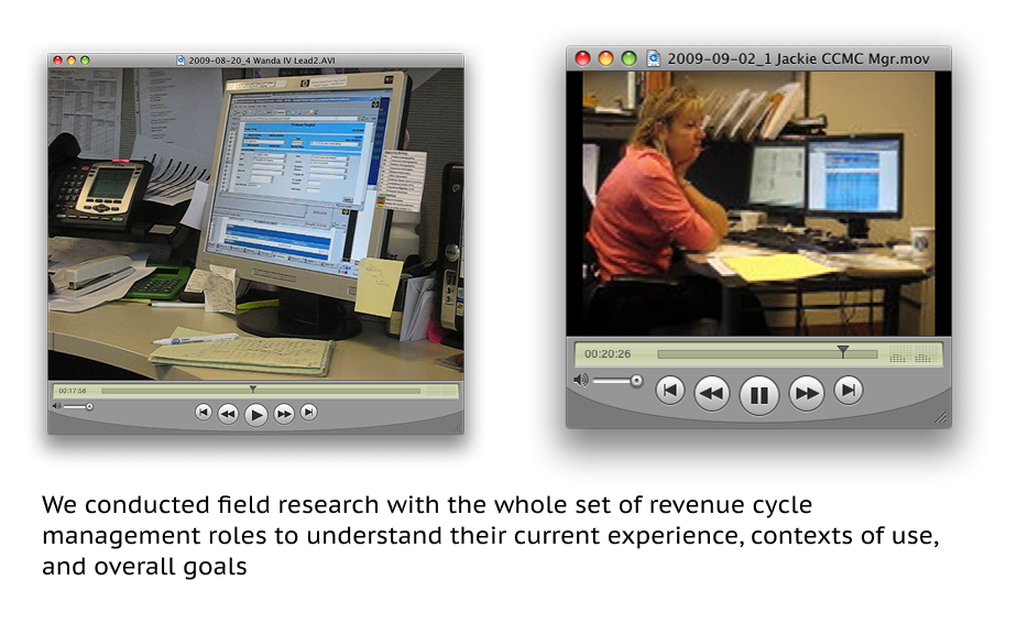
Each role had its own workflow, its own data needs, its own pressure points. Understanding all of them was necessary before any design work could begin, and the research surfaced something that reframed the entire design challenge.
Lizz realized: No aspect of the revenue cycle workflow operated in total isolation from another. The software itself could be the glue — and nobody had designed it that way yet.
That single organizing insight — that revenue cycle software, designed well, could serve as the connective tissue between all of these activities rather than yet another silo — shifted how the executives thought about what they were building. It also had immediate, concrete implications for patients: the most visible patient-facing improvement was reducing the number of pre-procedure calls from the hospital down to a single touchpoint that handled both pre-registration and billing items together. Fewer calls. Less confusion. A better experience on the way into a procedure that was probably already stressful enough.
THE DESIGN — AND THE COORDINATION CHALLENGE
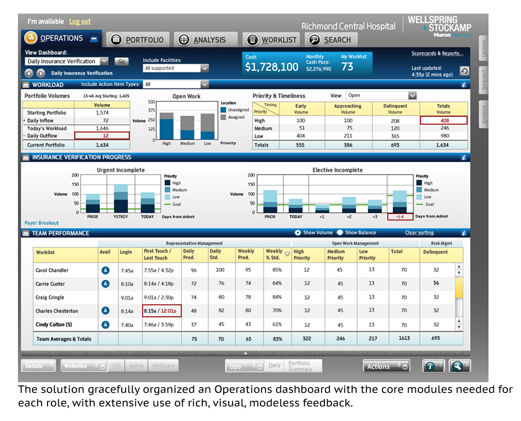
For front-line staff, we designed dense but usable role-specific interfaces built around a comprehensive worklist — the central organizing tool for each person’s daily work. The design incorporated a small graphical indicator that communicated the type and mix of items in the worklist at a glance, helping users identify and prioritize their work without having to open every item individually. In a high-volume operations environment, that kind of efficiency at the surface level compounds significantly over a working day.
As the platform scope expanded to cover the full operational stack, so did the design effort. At its peak, three consulting teams were working simultaneously on different parts of the system:
| Team 1 | Front-line workflows | Role-specific worklist interfaces for admissions, billing, collections, and financial counseling staff. |
| Team 2 | Patient touchpoints | Patient-facing interactions, including the consolidated pre-procedure communication touchpoint. |
| Team 3 | Business intelligence | Manager-facing dashboards, scoreboard, and BI reporting layer across all revenue-related departments. |
Keeping three teams aligned — on design language, interaction patterns, and the organizing “glue” concept — was as much a design leadership challenge as a design one. Every team needed enough autonomy to move at pace, and enough shared context to produce a coherent system rather than three adjacent products that happened to share a database.
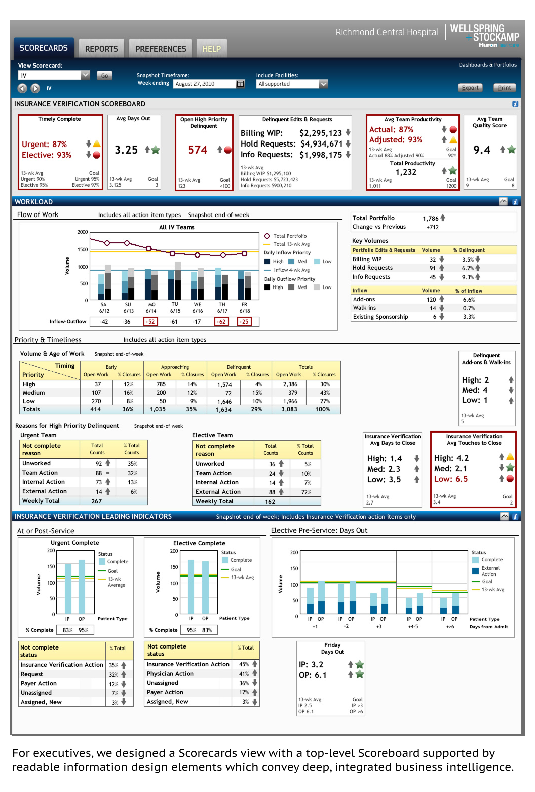
THE SCOREBOARD
One standout element in the BI layer was what we called the scoreboard — a compact, scalable display of key performance metrics which gave managers immediate insight into how their department was tracking against targets and thresholds. It became a hit with the client team: the kind of design solution that makes people say “why didn’t we have this before?” That’s a great sign the design is doing its job.
THE OUTCOME
A unifying concept that took hold
The “glue” framing resonated with Huron’s executives and stakeholders, reshaping how the product was understood and positioned — both internally and to hospital clients.
Reduced patient friction
Consolidating pre-procedure calls to a single patient touchpoint was a direct, measurable improvement in the patient experience — an outcome that emerged entirely from the research, not from the original brief.
A full enterprise platform, coherently delivered
Three parallel teams. One design system. A consistent product experience across the entire operational stack — from front-line worklists through executive BI dashboards.
The user experience for healthcare operational software tends to be among the most underserved areas of health tech. This is a tragic situation since the practice of healthcare typically involves significant operational effort from a range of important “behind-the-scenes” actors. Getting operational and service experiences right requires the patience to understand deeply interconnected workflows across many roles before making a single design decision — and the leadership capacity to coordinate the people doing that work so that we deliver a truly coherent software ecosystem.